Widgets
A widget is the graphic representation of an order. Each widget is specific to the type and subtype of the command to which it must be applied as well as the version from which Jeedom is accessed (desktop or mobile).
Default widgets
Before taking a look at the customization of widgets, let’s discover the possibilities offered by certain widgets present by default in the Core Jeedom.
Équipements
The devices (or tiles) have certain configuration parameters accessible via the advanced configuration of the device, “Display” tab → “Optional parameters on the tile”.
Optional parameter (s))
- dashboard_class / mobile_class : allows to add a class to the equipment. For example
col2for devices in mobile version will allow doubling the width of the widget.
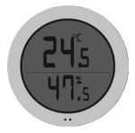
HygroThermographe
This widget is a bit special because it is a multi-command widget, i.e. it assembles the value of several commands. Here he takes temperature and humidity commands. To configure it, you must assign the widget to the temperature and humidity controls of your equipment.
Optional parameter (s))
- scale (échelle) : Allows you to change the size of the widget, by filling in the parameter scale to
0.5, the widget will be 2 times smaller.
IMPORTANT
It is ABSOLUTELY necessary that the generic types are indicated;Temperatureon the temperature control andHumidityon the humidity control (this is configured in the advanced configuration of the control, configuration tab).
NOTE
Attention on a design it is important not to put a command alone with this widget it will not work since it is a widget using the value of several commands, it is absolutely necessary to put the complete widget
Multiline
This widget is used to display the content of an info / other command on several lines.
Optional parameter (s))
- maxHeight (max height) : Allows you to set the maximum height of the widget (an elevator (scrollbar) will appear on the side if the text exceeds).
Slider Button
Widget for action / cursor control with button “+” and a button “-” allowing to act with precision on a value.
Optional parameter (s))
- step (pas) : Allows you to set the value change step (0.5 by default).
Rain
Widget for displaying water levels.

Optional parameter (s))
- scale (échelle) : Allows you to change the size of the widget, by filling in the parameter scale to
0.5, the widget will be 2 times smaller. - showRange : Set to
1to display the minimum and maximum values of the command. - animate : Disable the animation of the widget with a value of
0.
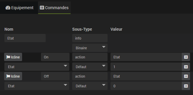
ON / OFF Icon Toggle
Regarding widgets for switches (on / off, turn on / off, open / close, etc…), it may be considered more visually pleasing to display only an icon reflecting the status of the device to be controlled.
This possibility can be used both with default widgets and with custom widgets.
To do so, it is necessary to take into account 2 prerequisites :
- The 2 action / fault commands must be linked to an order info / binary which will store the current state of the device.
Example
Advice
Uncheck “Afficher” of the info / binary command which will not need to be displayed.
- In order for the Jeedom Core to be able to identify which command corresponds to which action, it is essential to respect the following naming for 2 action / fault commands :
''
  'on':'on',
  'off':'off',
  'monter':'on',
  'descendre':'off',
  'ouvrir':'on',
  'ouvrirStop':'on',
  'ouvert':'on',
  'fermer':'off',
  'activer':'on',
  'desactiver':'off',
  'deactivate':'off',
  'lock':'on',
  'unlock':'off',
  'marche':'on',
  'arret':'off',
  'stop':'off',
  'stop':'off',
  'go':'on'
‘’
Trick
As long as the standardized name remains readable, it is possible to adapt the naming, for example open_volet or shutter_close, step_2 and stop_2, etc.
Custom widgets
The Widgets page, accessible from the menu Tools → Widgets, allows you to add custom widgets in addition to those available by default in Jeedom.
There are two types of custom widgets :
- Widgets Core template-based. These widgets are managed by the Jeedom Core and therefore monitored by the development team. Their compatibility is assured with future evolutions of Jeedom.
- Widgets Third based on user code. Unlike Core widgets, the Jeedom development team does not have control over the code inserted into these widgets, their compatibility with future developments is not guaranteed. These widgets therefore need to be maintained by the user.
Gestion
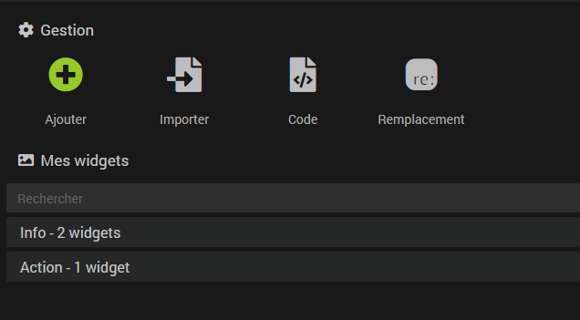
You have four options :
- Add : Allows you to add a widget Core.
- Import : Allows you to import a widget as a previously exported json file.
- Coded : Access the widget editing page Third.
- Replacement : Opens a window allowing you to replace a widget with another on all devices using it.
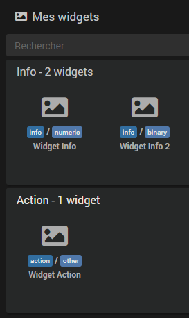
My widgets
In this part you will find all the widgets that you have created classified by type.
Trick
You can open a widget by doing :
Clickon one of them.Ctrl + ClickorClick + Centerto open it in a new browser tab.
The search engine allows you to filter the display of widgets according to different criteria (name, type, subtype, etc…). The Esc key cancels the search.

To the right of the search field, three buttons that can be found in several places in Jeedom:
- The cross to cancel the search.
- The open file to unfold all panels and display widgets.
- The closed file to collapse all panels and hide widgets.
Once on the configuration page of a widget, a context menu is accessible by `` Right Click ‘’ on the tabs of the widget. You can also use a Ctrl + Click or Click + Center to directly open another widget in a new browser tab.
Creating a widget
Once on the page Tools → Widgets you have to click on the button “Add” and give a name to your new widget.
Then :
- You choose whether it applies to an order of type Action or Info.
- Depending on the previous choice, you will have to choose the subtype of the order.
- Finally the template among those which will be available according to the previous choices.
- Once the template has been chosen, Jeedom displays the configuration options for it below.
The templates
Definition of a template
To put it simply, it’s code (HTML / JS), integrated into the Core, some parts of which are configurable by the user via the graphical interface of the menu Widgets. From the same database and taking into account the elements that you will enter in the template, the Core will generate unique widgets corresponding to the display you want to obtain.
Depending on the type of widget, you can generally customize the icons, put the images of your choice and / or embed HTML code.
There are two types of template :
- The “simple” : as an icon / image for the “We” and an icon / image for the “Off”.
- The “multistates” : This allows you to define, for example, an image if the command has the value “XX” and another so greater than “YY” or if less than “ZZ”. Also works for text values, an image if the value is “foo”, another if “plop” And so on…
Remplacement
This is called a simple template, here you just have to say that the “We” matches such icon / image (using the choose button), the “Off” to such other icon / image, etc…
The box Time widget, if available, displays the duration since the last change of state under the widget.
For templates using images, you can configure the width of the widget in pixels depending on the support (Desktop width & Movable width). Different images can also be selected according to the active theme of Jeedom (light or dark).
Trick
For advanced users, it is possible to put tags in the replacement values and to specify their value in the advanced configuration of the command.
If, for example, in Desktop width you put as value#largeur_desktop#(**be careful to put the**#**autour**) puis dans la configuratiwe avancée d'une commande, ongland affichage → "**Paramètres optionnels widget**" vous ajoutez the paramètrelargeur_desktop(**sans les**#) and give it the value “90”, this custom widget on this command will be 90 pixels wide. This allows you to adapt the size of the widget to each order without having to make a specific widget each time.
Test
This is called multistate templates (several states). Instead of putting an image for the “We and / or for the “Off as in the previous case, you will assign an icon according to the validation of a condition (test). If this is true then the widget will display the icon / image in question.
As before, different images can be selected depending on the theme active on Jeedom and the box Time widget displays the duration since the last change of state.
The tests are in the form : ``#value# == 1, #value#`will be automatically replaced by the current value of the command. You can also do for example :
- ``#value# > 1`
#value# >= 1 && #value# <= 5#value# == 'toto'
NOTE
It is essential to show the apostrophes (‘) around the text to compare if the value is text (info / other).
NOTE
For advanced users, it is also possible to use javascript functions such as#value#.match ("^ plop"), here we test if the text starts withplop.
NOTE
It is possible to display the value of the command in the widget by specifying#value#in the HTML code of the test. To display the unit add#unite#`.
Code Widget
Tags
In code mode you have access to different tags for orders, here is a list (not necessarily exhaustive)) :
- #name# : command name
- #valueName# : name of the command value, and = #name# when it’s an info type command
- #minValue# : minimum value that the command can take (if the command is of type slider)
- #maxValue# : maximum value that can take the command (if the command is of type slider)
- #hide_name# : empty or hidden if the user asked to hide the name of the widget, to put it directly in a class tag
- #id# : command id
- #state# : value of the command, empty for an action type command if it is not linked to a status command
- #uid# : unique identifier for this generation of the widget (if there is several times the same command, case of designs: only this identifier is really unique)
- #valueDate# : date of the command value
- #collectDate# : date of the command collect
- #alertLevel# : alert level (see here for the list)
- #hide_history# : whether the history (max, min, average, trend) should be hidden or not. As for the #hide_name# it is empty or hidden, and can therefore be used directly in a class. IMPORTANT if this tag is not found on your widget then the tags #minHistoryValue#, #averageHistoryValue#, #maxHistoryValue# and #tendance# will not be replaced by Jeedom.
- #minHistoryValue# : minimum value over the period (period defined in the Jeedom configuration by the user)
- #averageHistoryValue# : average value over the period (period defined in the Jeedom configuration by the user)
- #maxHistoryValue# : maximum value over the period (period defined in the Jeedom configuration by the user)
- #tendance# : trend over the period (period defined in the configuration of Jeedom by the user). Attention the trend is directly a class for icon : fas fa-arrow-up, fas fa-arrow-down or fas fa-minus
Update values
When a new value Jeedom will search in the page if the command is there and in Jeedom.cmd.update if there is an update function. If yes it calls it with a single argument which is an object in the form :
''
{display_value:'#state#',valueDate:'#valueDate#',collectDate:'#collectDate#',alertLevel:'#alertLevel#'}
‘’
Here is a simple example of javascript code to put in your widget :
''
<script>
    Jeedom.cmd.update ['#id#'] = function (_options){
      $('.cmd[data-cmd_id=#id#]').attr('title','Date de valeur : '+_options.valueDate+'<br/>Collect date : '+ _options.collectDate)
      $('.cmd[data-cmd_id=#id#] .state').empty().append(_options.display_value +' #unite#');
    }
    Jeedom.cmd.update ['#id#']({display_value:'#state#',valueDate:'#valueDate#',collectDate:'#collectDate#',alertLevel:'#alertLevel#'});
</script>
‘’
Here are two important things :
''
Jeedom.cmd.update ['#id#'] = function (_options){
  $('.cmd[data-cmd_id=#id#]').attr('title','Date de valeur : '+_options.valueDate+'<br/>Collect date : '+ _options.collectDate)
  $('.cmd[data-cmd_id=#id#] .state').empty().append(_options.display_value +' #unite#');
}
‘’
The function is called during an update of the widget. It then updates the html code of the widget_template.
''
Jeedom.cmd.update ['#id#']({display_value:'#state#',valueDate:'#valueDate#',collectDate:'#collectDate#',alertLevel:'#alertLevel#'});
‘’
The call to this function for the initialization of the widget.
Exemples
You will find here examples of widgets (in dashboard and mobile folders)